STAC MATERIAL HANDLING, INC.
BRANDING INITIATIVE
The branding strategy focused our attention to key elements and tone of voice and materials that we would execute. Branding materials include business cards, letterhead, envelopes, complete website redesign, email and social media strategy, brochure design and even redesigning the exterior look of their corporate headquarters. Flip through the gallery below to see the progress of this brand,.
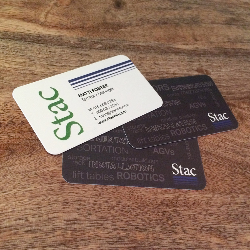
Running Design Studio is proud share with you the work that was created for Stac Material Handling, Inc. Stac was looking to create more consistency and redefine the brand look and messaging. After completing my stretch guide, it was very clear that their attention to details and their dedication to their customers was second to none. Their entire staff echoed these sentiments: “We provide the best products, service and installation for your material handling needs.” With this knowledge we set about creating the story that focuses on these elements. We found ways to use the blue bars, a key component of their logo, in fresh and engaging ways. They also have a vast product offering, so on the business cards we implemented using these key products in a graphic way. In some places words, would have become overwhelming, so we created a set of icons to match these categories that proves easily recognizable to their customers. Let’s dive into a few of the pieces in more detail.
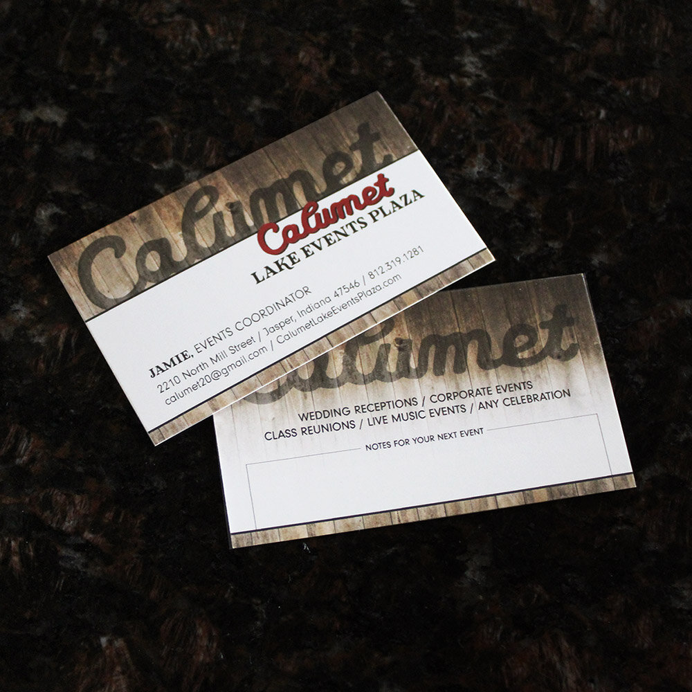
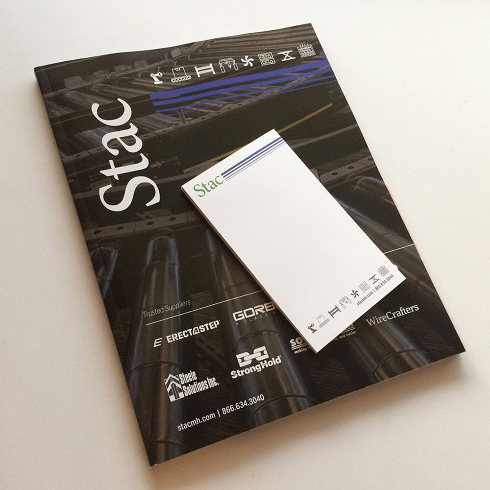
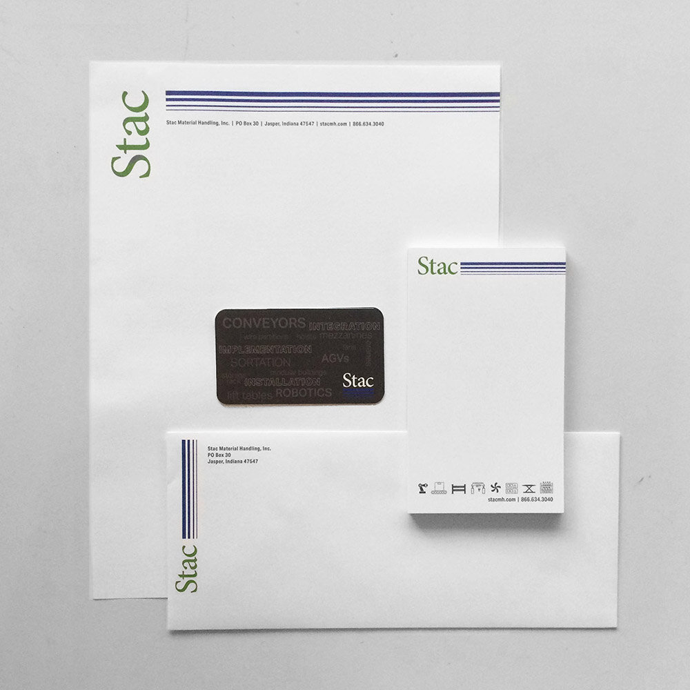
BUSINESS COLLATERAL
The business collateral can be the first impression that a customer may see. We took the opportunity to create a streamlined look for their business cards, letterhead, envelopes and notepads, while injecting a fresh dose of creativity with graphic words and sleek product icons.
WEBSITE
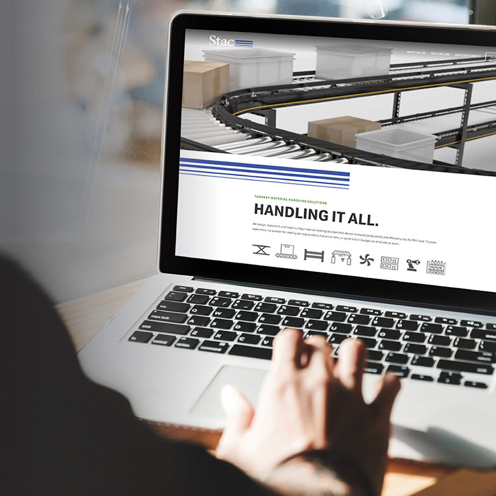
We wanted to developed a clean, modern experience for their website. Beautiful custom touches like product icons and the use of the blue bars from their logo take their site to the next level. Content creation focused on delivering key product information in easily digestible ways. Infographics and statistics became main components of the product pages, while product installation images make it easy for customers to envision what their project could look like. The end result is a modern, informational site that is easy on the eyes while perfectly showcasing their amazing capabilities. Take a look for yourself at stacmh.com
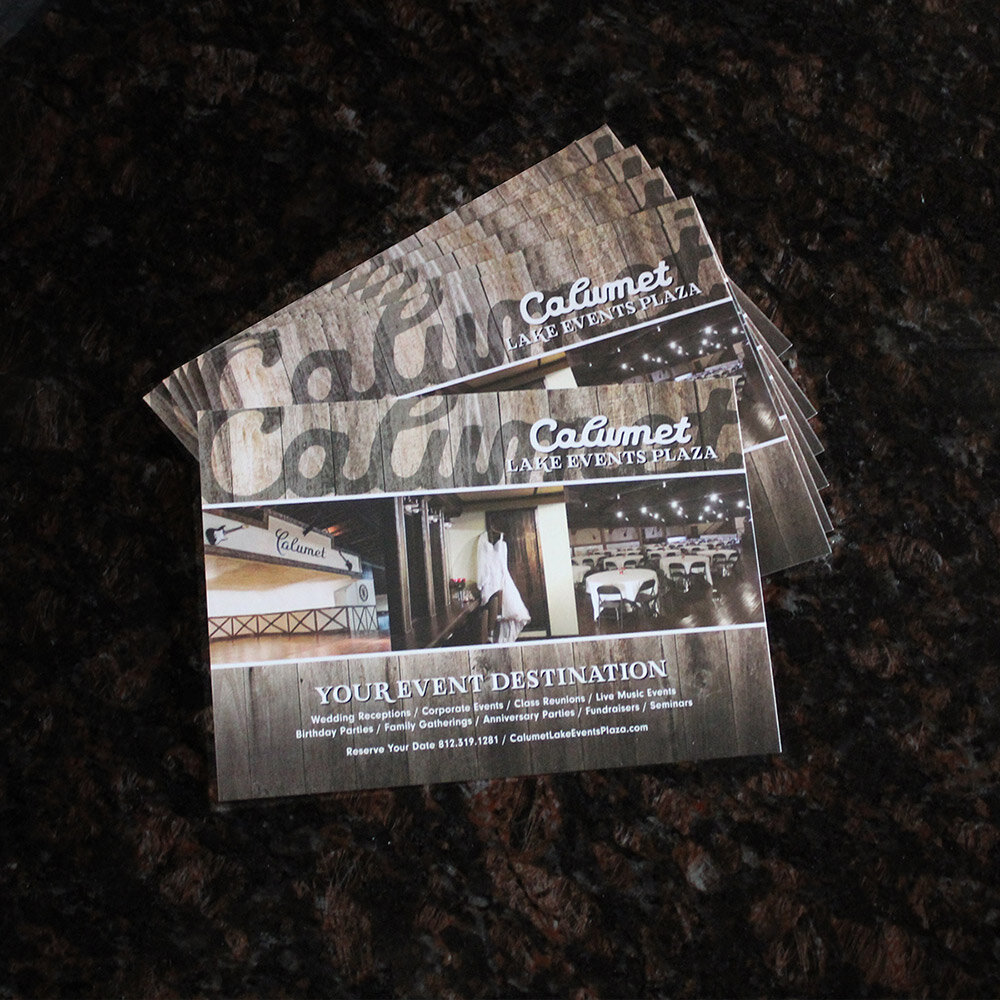
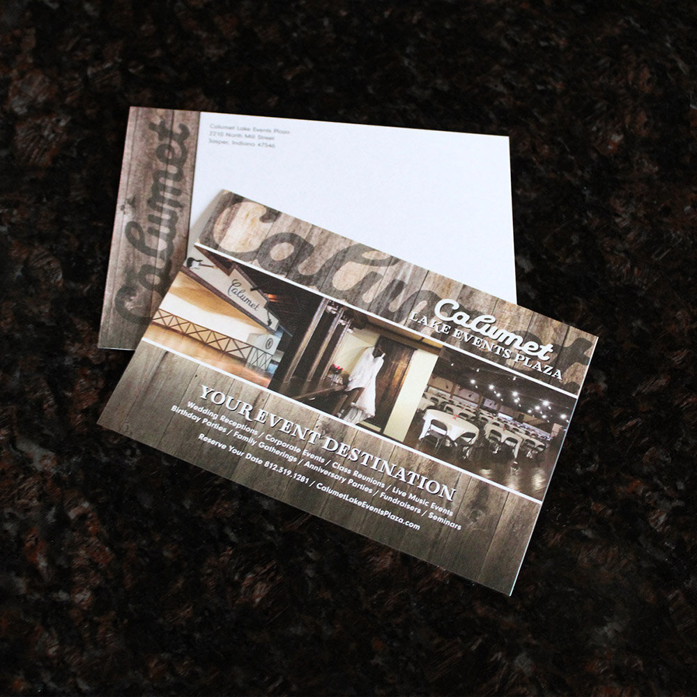
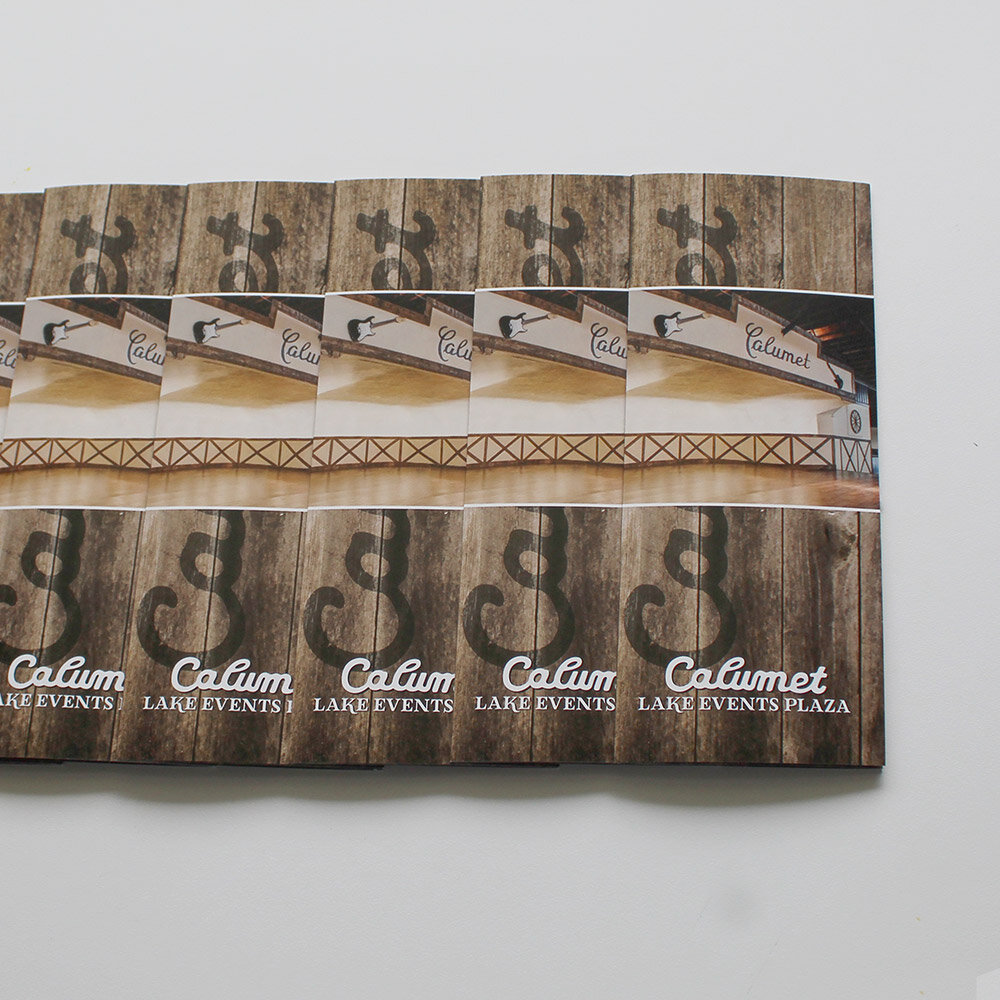
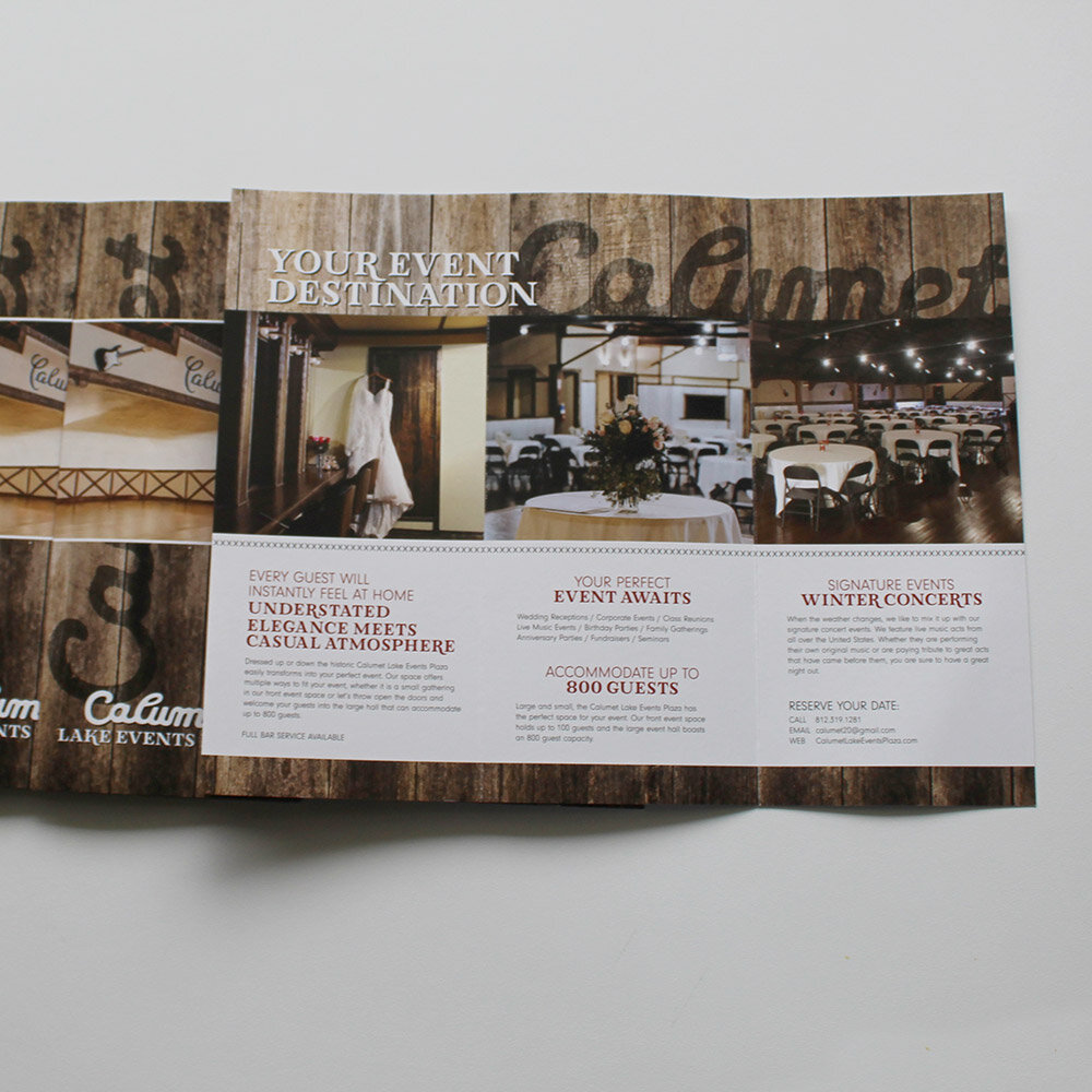
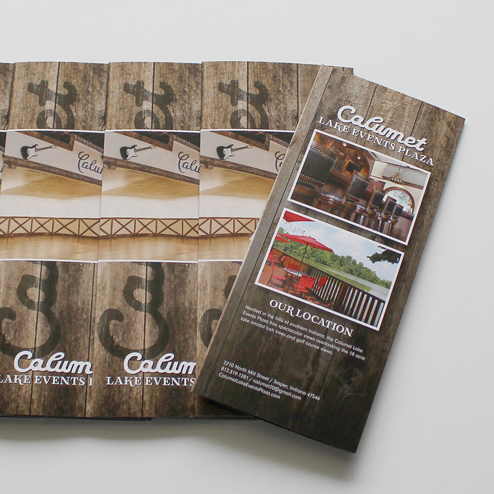
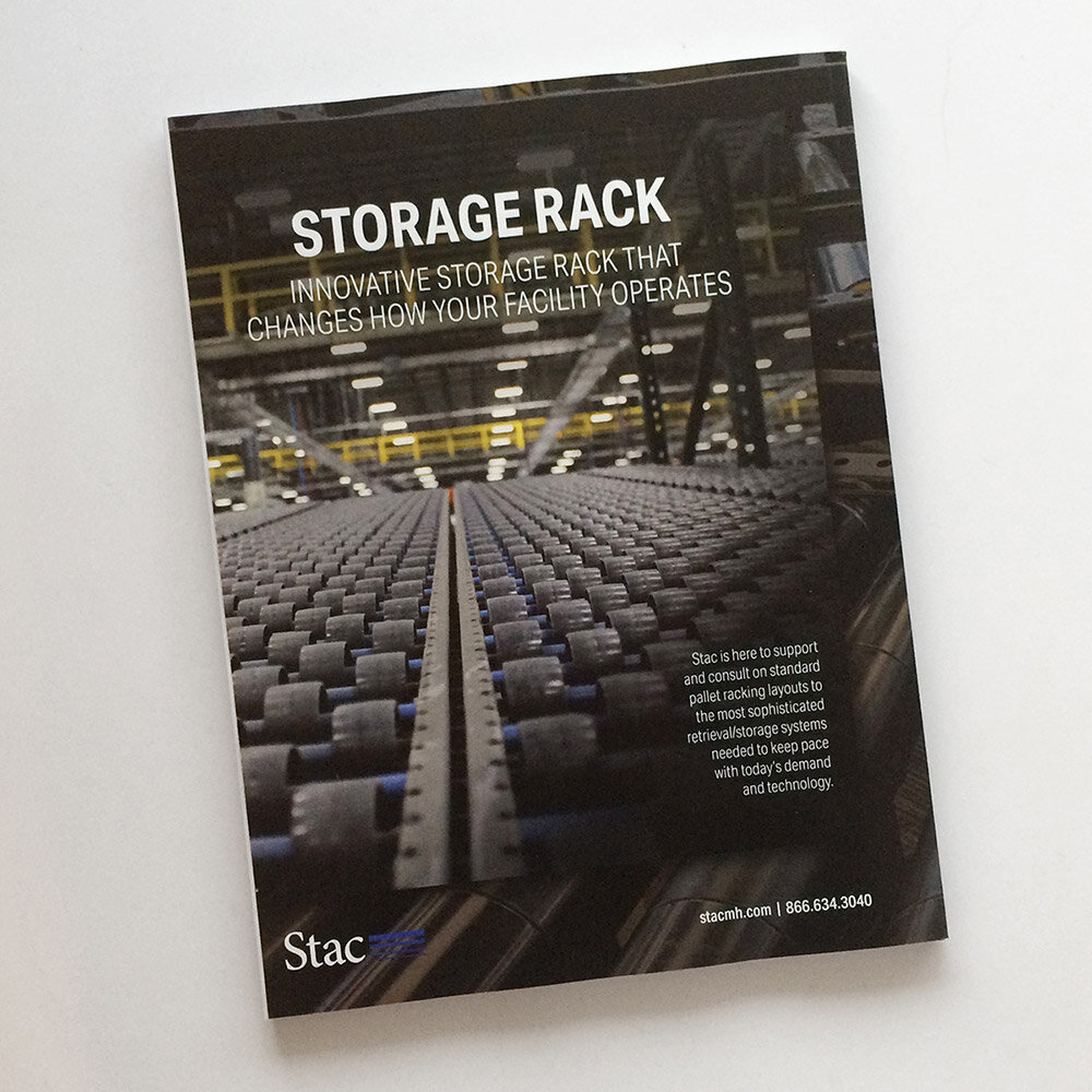
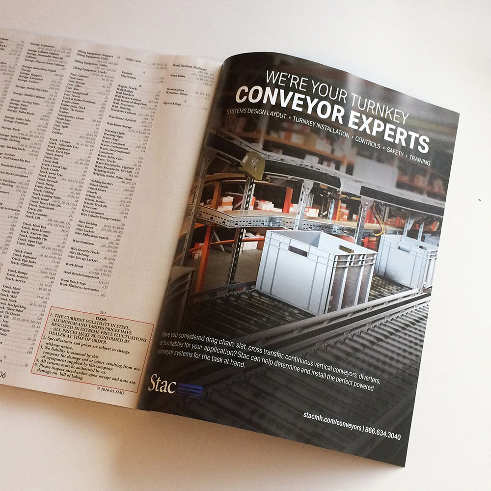
BROCHURE COLLATERAL
Brochure and catalog design allows their products to shine. Moody close up product imagery against crisp white text and their classic blue bars running horizontally, create an eye-catching look that gathers attention from anyone who sees it. These pieces leave a lasting impression of what their products could do for your facility. Additional gate folded materials will be rolled out in the coming months.
EMAIL + SOCIAL MEDIA
We focused on finding ways to bring consistency to the conversation that Stac was having through email and social channels. Consistency in look and timing was key to making important strides with engagement with their customers. Meaningful product information and clean designs are key to showcasing how their products can make facilities more productive and efficient.
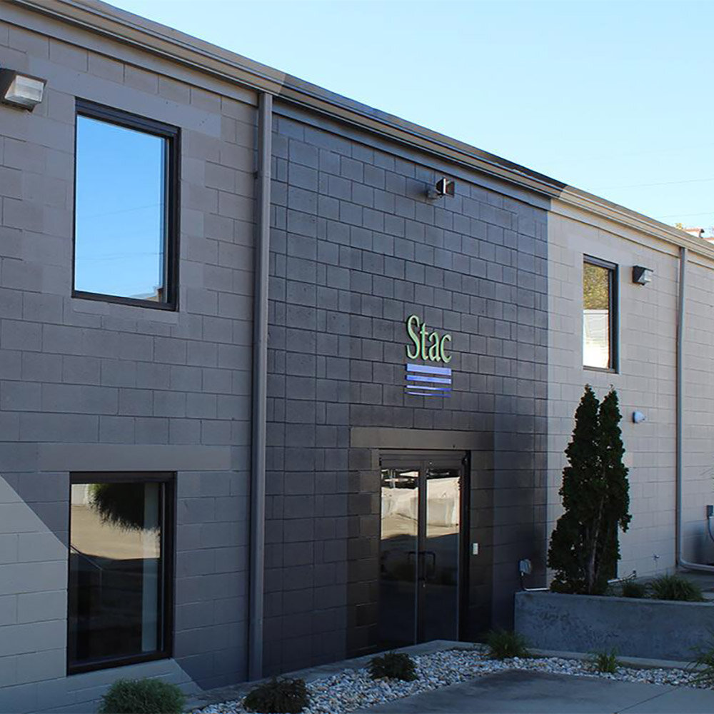
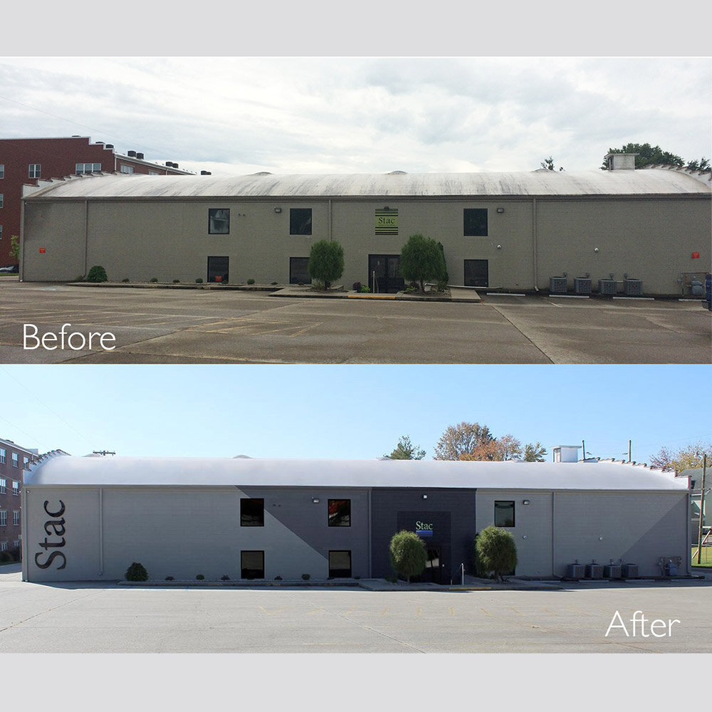
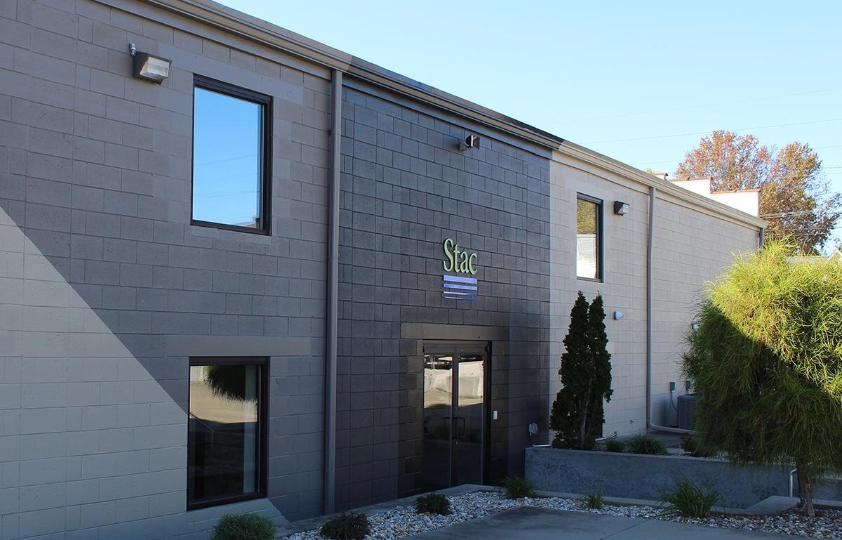
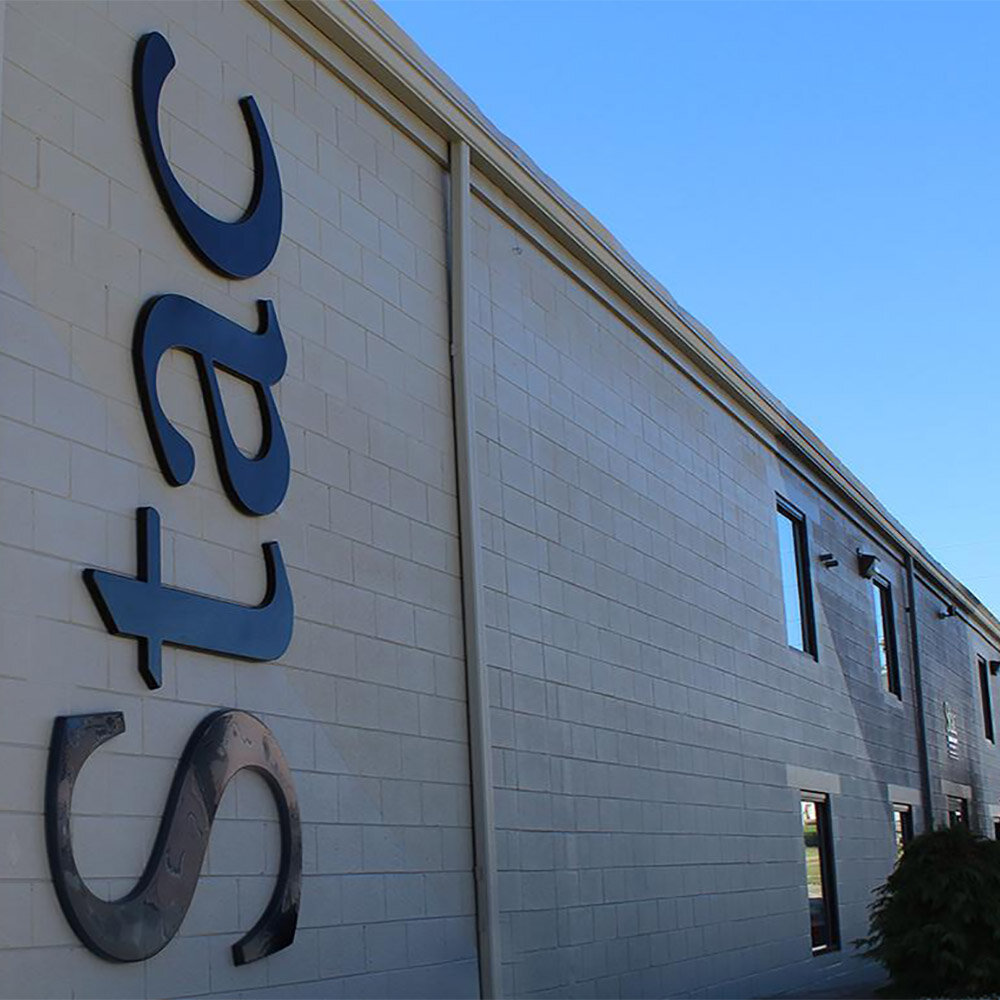
EXTERIOR BUILDING REFRESH
While working on the branding initiative, Stac asked that the studio find a way to align the exterior of their corporate headquarters with the new look. Their building has a warehouse feel to it and was pretty nondescript. We brought in different tones of paint that added dimension and interest to the building. The Stac lettering was run vertically for a very modern look that stands out. The best compliment is that people have said it doesn’t even look like the same building.